


The Local newsletter is your free, daily guide to life in Colorado. For locals, by locals. Sign up today!
Steps from Denver’s Washington Park is a quiet street tightly lined with nearly indistinguishable bungalows. But one look inside the 1922 home of Julie and Joe Anderies reveals a cheerful, airy dwelling—packed with handsome furnishings and treasures from all over the world—that’s anything but ordinary. Given Julie’s work as an art historian and Joe’s as a jazz musician, perhaps it’s no surprise that when they went searching for a professional to revamp their home, they were hooked by interior designer Katie Schroder’s colorful, unexpected interiors. With the house essentially stripped down to the studs, Schroder, principal of Atelier Design Group, had plenty of room to play. Here’s how she incorporated a long list of must-haves with both modern and antique trappings in a modest space.


5280 Home: In this home, it feels like every little detail commands attention. How did it all come together?

Katie Schroder: We started with a single piece of Schumacher fabric [Temara Embroidered Print on the kitchen banquette] and a photograph of teal kitchen cabinets, which set the tone for the whole house because the color is so prominent. When I first met Julie and we started talking about the project, I was like, “You want teal cabinets? Let’s go.” Not many people say that! She also enjoys the idea of each piece having a story, if possible. There were times when we couldn’t always make that work, but that was a theme throughout.
We want to ogle and touch everything! How did you play with color and texture?
Julie was a unique client in that she was really open to and excited about using all types of different colors. With her liking that Schumacher fabric—it has eight colors!—it left the door wide open. Because [the Anderies] are art collectors and have so many rotating pieces, we wanted to keep the main shell of the home rather neutral, so we picked a taupe-gray paint for the walls [Benjamin Moore’s Thunder] in order to have fun with the upholstery and art. Ultimately, we kept it within a jewel-toned theme. And in the midst of designing their home, the couple went to Morocco and purchased a few rugs, so that ended up influencing the design as well.
And how did you manage to pack in so many different textiles without the space feeling busy?
We just went for it. That’s what’s so fun about Julie: She wasn’t afraid. The master bedding is a great example of finding balance. The duvet cover is really simple, and the largest pattern [in the room] is the one on the headboard. We threw in a mix of bohemian-type patterned pillows and fun colors but also kept the upholstery on the base of the bed solid and simple. It lets all the other wonderful elements shine.


Beyond the bohemian and Moroccan influences, midcentury design is front and center. Was that intentional?
Yes! We wanted to incorporate a midcentury vibe, and I think it’s most obvious in the living room and dining space. The dining set is Mexican midcentury, and we had the seats recovered [in Pollack’s Kingdom of Kuba fabric]. You can also see the influence in the stained glass in the dining-room doors that was done by a friend of Julie’s.
Julie mentioned that the stained glass does double duty, both as artwork and as a privacy screen. How else did functionality play a role in the design?
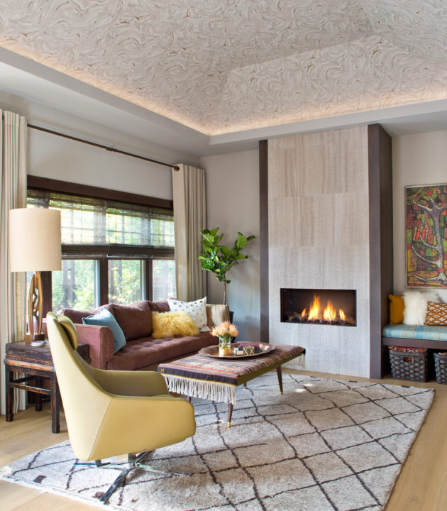
The architect, Jon Hindlemann, had the idea to tuck the living room in the back of the home, behind the kitchen, which I thought was a nice, fresh change on a layout. When you walk into their home, you’re drawn into the dining room [which opens to] the kitchen—and we all know kitchens are where everyone gathers and hovers when you entertain. Plus, Julie and Joe were downsizing, and despite discarding lots from their old home, they still had tons of stuff. Built-ins and hidden closets were crucial. In the living room, we did a cool Italian cabinet that houses a TV but also hides books, movies, and other electronics. The nearby bench seat makes the space feel open, but we’ve got baskets underneath for storage. The trick was having plenty of storage without making the space feel heavy.
Speaking of the living room, that vaulted ceiling looks like marble. Gorgeous.
It’s wallpaper! I love it—it really makes the room shine. Julie was leery of the idea at first, but I kept pushing her. I showed her a bunch of patterns and textures, and we kept coming back to the marble [Makrana by Harlequin in Smoke] because it was organic and really neutral. It’s so nice and unusual to have a vaulted ceiling in the back of your home, and we wanted to call attention to it. Wallpaper really was the perfect solution.
It sounds like you two had great rapport. Is it always this easy?
I try to build relationships with all my clients. The first few months, we’re trying to get to know each other and they’re trying to trust me and my choices. So we go slowly. We start working on basic finishes: cabinets, countertops, tile. We can dial in the harder choices later as they begin to trust my aesthetic; that’s when they become more receptive to pushing the envelope because they know the overall vision is something worth pursuing.


