


The Local newsletter is your free, daily guide to life in Colorado. For locals, by locals. Sign up today!
Remodeling this two-story Uptown apartment presented designer Katie Schroder with a challenge: “The husband is very conservative; the wife is not,” she says. “She loved the fact that we are a very color-forward firm, but he was a little scared.”
Living with color wasn’t entirely unfamiliar to the couple. For years, they’ve been amassing a collection of 20th-century modern art that includes vibrant works by Avedon, Miró, and Warhol, and the wife collects midcentury American glass, “particularly for its bright colors,” she says. Even so, “hot pink isn’t something that I often deal with,” the husband says—at least, not until Schroder got her hands on his living room. Here, the designer shares her secrets to creating bold rooms that even a color-skeptic could love.

- New Horizons
- 3 Things for Design Lovers to Look Forward to This Summer
- What You Need To Know About Populus, an Eye-Catching Hotel Coming to Civic Center Park
- Would You Ever Own a Home With Friends (or Strangers)?
- Easy, Breezy Living in an Art Collector’s Country Club Castle
- Instant Curb Appeal: 5 Steps to Refresh Your Home’s Exterior
- 9 Stylish Accessories for the Ultimate Backyard Movie Night
1. Start Simply
“Because I like color so much, I like to start with a simple floor and a light neutral wall,” Schroder says of the quiet backdrop she created with white-oak floors and walls painted Benjamin Moore’s warm White Dove. “It was a surprise to [me and my husband] how well the colors of the furnishings work with the art,” the homeowner says. “I think sticking to the consistent wall color—taking that element out of the competition—really helped.”


2. Build a Palette
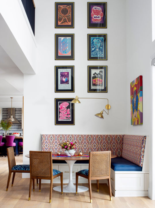
In an open floor plan like this, a cohesive color scheme is key, Schroder says. But that doesn’t mean limiting yourself to just two or three hues. “I think the more colors in a palette, the better,” says the designer, who pulled a rainbow of jewel tones from the couple’s art onto textiles, cabinetry, and tile. Andy Warhol’s “Ingrid Bergman with Hat” inspired the living room’s raspberry-pink velvet and ocean-blue chenille armchairs, as well as the adjacent dining area’s wall of federal-blue cabinetry by Caruso Kitchens.
3. Add Some Texture
Texture, like pattern, is all about the mix—“something smooth, something linen-like, something chunky-monkey,” Schroder says. On the main floor, she chose a vinyl for the banquette seat and counter stools, “knowing there’s a sheen to it,” and a classic wool tweed for the living room sofa, “for a matte, men’s-suiting vibe,” while the blue chenille fabric on the tall-back chairs “has a lot of movement.”
4. Create Layers
When taking color cues from fabric or art, Schroder warns against being too literal. “I enjoy pulling out a color that’s least represented in a fabric so that the rest of the colors shine,” she says, “or not addressing some of the colors within a fabric at all, so that the palette looks interesting and layered.” Another layering technique: the two-fabric chair, as seen in the dining room, where Schroder upholstered the seats with a solid velvet and the backs with a print, “so you get that ooh as you walk around,” she says.


5. Play With Patterns
Like many clients, this couple was drawn to patterns with a similar style and scale. “But I warned, ‘It’s going to look flat if we stay in that zone,’” Schroder says. “When I think about mixing patterns, there should be a stripe, a solid, and a woven, and a mix of large, medium, and small scales.” Or, in the case of this home’s main bedroom, a Persian-rug print, a geometric burnout velvet, and a classic Greek key motif. Ever a dull moment? Not in this house.


