

The Local newsletter is your free, daily guide to life in Colorado. For locals, by locals.
Living Room
Most families designate play rooms to corral toys, but one Boulder couple with three youngsters had a different idea: to set aside a space that’s just for adults. “The couple is super fun,” designer Erin Iba says, “and the husband said, ‘I want a space to sit and drink scotch and not step on Legos.’ ” This sumptuous living room, dubbed the “sexy martini lounge,” lets in bright views during the day and transitions to a cozy den at night. To create that low-lit ambience, Iba layered saturated hues that create visual texture—and don’t exactly match. The dark ceiling, painted in high-gloss metallic Radiance by Benjamin Moore, bounces light around the room; Alpha Workshops’ wallpaper surrounding the fireplace doubles as an art installation; and the barrel-backed club chairs turn on a swivel—perfect for those late-night chats.
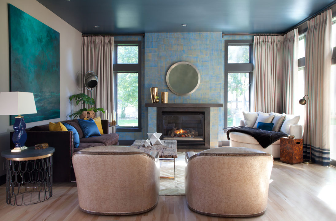
Pro: Interior design by Erin Iba, Iba Design Associates.

Designer Q+A
What design choices do you make here that reflect Colorado’s natural beauty?
For me, it’s not about a color palette. People always say that they bring the colors of Colorado inside. I can’t compete with nature—I wouldn’t even try. For me, it’s more about orienting everything to nature. It should be about the view, not about the placement of the TV.
You work in Denver and New York City. Is there anything you wish we’d import from the Big Apple?
The Flower District! I love to walk through any time I can. It forces creativity. I’ll see a tub of branches placed next to some peonies or lilies of the valley, and it instantly makes me think about scale, proportion, and color. To stop and look at a living example really gets me out of the mathematical “AutoCAD-floorplan-tear sheets” mode we put ourselves in as designers.
What do you wish New York City could learn from Denver?
Oh gosh, so much [laughs]. It’s clichéd to say quality of life, but I do think it’s important to mention. In New York City, it is an accepted norm that people work 24/7. When you’re in the design business, which is really about customer service, it becomes dangerous when people don’t ever shut off. Here in Colorado, I’ll be driving somewhere at 5 p.m., and I’ll see people out mowing their yards. The workday ends! People have embraced the attitude that life is important.
Which design trend are you loving lately?
Honestly, I just don’t believe in trends. They’re in and then they’re out. Instead, I think about things I wish we’d get back to. I really, really wish people would hold off on instant gratification (“I saw this online, and I want it, and I can have it in two weeks!”) and get comfortable with the idea that a house evolves over time. It takes months for a bronze sculpture or handmade wallpaper to be crafted. Some things are worth the wait.
Kitchen
When you have five kids and an energetic Labrador retriever, you spring for the for-sale home that can hold the entire brood. So it went for the family who lives in this 1890s Congress Park Victorian, which they transformed with the help of architect Steven Perce of Bldg Collective and builder Ryan Wither of Buildwell (in what Perce jokes was “the fastest Houzz-to-hammer project ever,” thanks to stellar team vibes).
With the home’s original layout mostly intact, the kitchen was, not surprisingly, a dated problem zone. “It was in the back of the home,” Perce says, “and completely visually separated from the front of the house.” The architect opened up the space to suit modern family life, furnishing it with what he calls “heritage modern” style. Carrara-marble countertops and cleaned-up existing trim suggest the formality of the Victorian era, while brushed-white-oak cabinets by KTM Millwork, large-format Mosa floor tile, and a linear pendant by Stickbulb over the island make it a contemporary Colorado charmer.
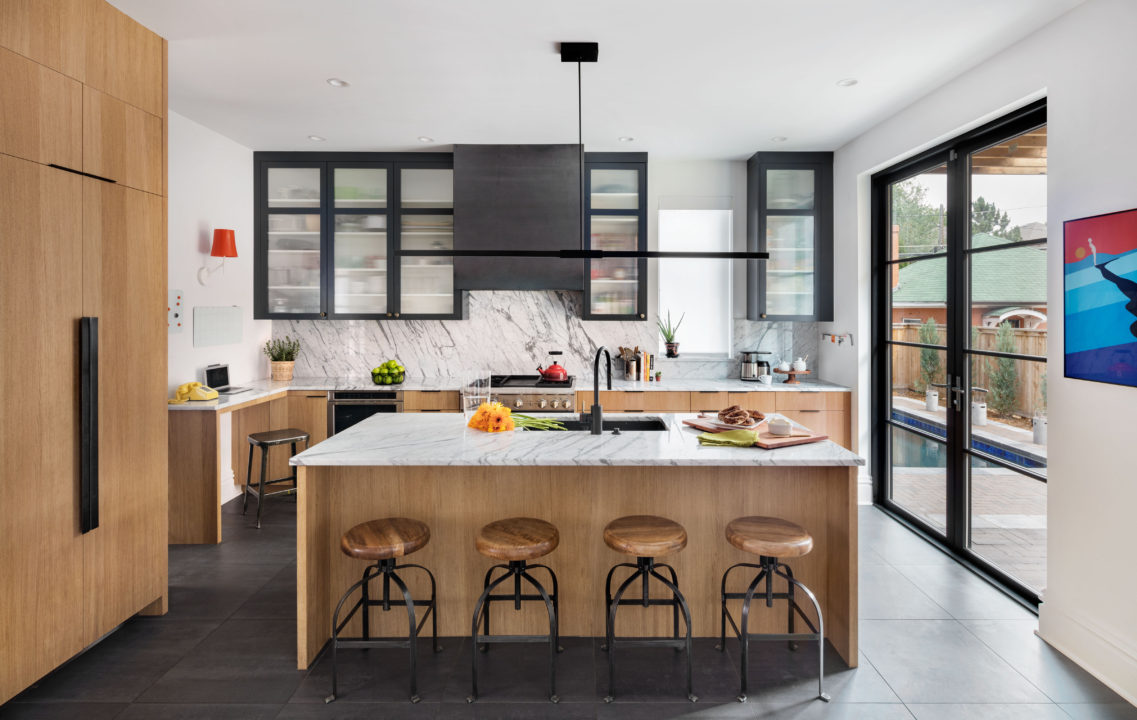
Pros: Architecture and interior design by Steven Perce, Bldg Collective; Construction by Ryan Wither, Buildwell.
Architect Q+A
What’s your take on modernism in Colorado?
Modernism is an approach to design—not just an aesthetic. We start by understanding the built, natural, and ecological qualities of a site, which allows us to respond to those conditions in ways that make sense—and make better homes. When modernism is understood as an approach and a process, it allows our clients to better connect with their surroundings, which is important in Colorado.
Shoot straight: your pet peeves about local design?
Colorado has been very slow to accept contemporary and modern design. But within residential design, this conservative side of Colorado has slowly been shifting, thanks to the rapid growth of the past few years. Now I’d like to see more progressive designs in our public spaces and buildings.
You’re based in Boulder. What design challenges are you seeing there?
The major one is the cost of construction; along most of the Front Range, construction prices have been shooting through the roof. In Boulder, add in the high cost of real estate, and it’s very expensive to build or renovate a home. A second challenge—not exclusive to Boulder—has to do with the rapid growth and speculative real-estate market. Many people hesitate to make decisions based on what they like; they get tripped up by wondering what future buyers will think. Designing for the lowest common denominator just doesn’t make for enduring design.
Quick: Name one of your favorite local buildings.
The three interior public spaces in Union Station: the Great Hall, Terminal Bar, and Cooper Lounge. The New York City firm AvroKO did an amazing job of combining the romanticism of luxury train stations with the need for an eclectic social hub.
What do you wish people knew about design?
Design is a process, not a commodity—and you get what you pay for.
Entry
This energizing entryway is a perfect introduction to a fresh-traditional Greenwood Village home and its owners—an active family who loves to travel. In fact, the scheme fittingly began with the bright, textured rug they found during a trip to Santa Fe, New Mexico. From there, Nadia Watts of Nadia Watts Interior Design says she worked with the couple to develop the design…slowly. “We were able to balance the colors well by not forcing the design, and by taking our time to find the right pieces the clients loved.”
Those favorites include a custom Lucite table by Pease Plastics, stools by Noir, and—for the real exclamation point—a color-drenched painting by Arizona artist Joanne Kerrihard (from Denver’s William Havu Gallery). The work is a dramatic 5 by 5 feet—perfect for the expansive wall, Watts says—and sets the striking tone the designer was after. The key to the composition is in the calm: the quiet table, stools, and accessories that allow the art to make a right-sized welcome.

Pros: Interior design by Nadia Watts, Nadia Watts Interior Design; Architecture by Kathy Jonas, ArchStyle, Inc.; Construction by Robert Nettleton, Nicholas Custom Homes
Kid’s Room
This kicky kid’s room shows off a very-2018 design idea—that no space should be exempt from great design, even the one inhabited by a young child. Working with a creative family in Five Points, interior designer Megan Moore of Dado devised a smart but not-so-serious scheme, aiming to “create a fun place for a kid that could be cleaned up easily,” she says.
To keep clutter in check, Moore brought in a vintage dresser and designed a series of brightly painted shelves that fit into the room’s existing nooks. To dial up the delight, she crowned the space with an ombré chandelier and decked the walls with a kaleidoscopic mural that matches the daughter’s bubbly personality. “The mural is energetic because of the colorway,” Moore says, “but the triangles present the feeling of organization and
structure.” That’s what we call a kid- and parent-friendly concept.

Pro: Interior design by Megan Moore, Dado.
Dining Room
This light, fresh space, which puts an effortless spin on “modern classic,” is practically the opposite of its (intense) pre-makeover scheme: “There were black accents, a yellow-and-red toile fabric on the walls, and heavy matching toile draperies,” says interior designer Beth Armijo, principal of Armijo Design Group.
The designer worked with a young family to bring the historical dining room, in one of Cherry Hills’ oldest homes, into the present by “pairing old and new, and formal with a bit of fun,” she says. To make the mix feel cohesive, Armijo used shimmery, organic touches as a connecting thread. A metallic Jim Thompson leaf-print wallpaper (called Nirvana) complements a bold Helios Credenza by John-Richard and a branch-inspired Ondine chandelier by Ironware International. Add to that a serene nest painting by Denver artist Elaine St. Louis and a table by local furniture-maker Ryan Schlaefer, and you get an only-in-Colorado feel.

Pros: Interior design by Beth Armijo, Armijo Design Group; Architecture by Harry James Manning; Construction by Dan Fuller, Haley Custom Homes
Master Bathroom
To create this master retreat in a super-sleek Boulder home, architect Dale Hubbard of Surround Architecture deployed a subtle-but-surefire design move: layering texture on texture. Weathered Wyoming snow fence (on the vanity wall) plays against creamy poured-concrete floors, oh-so-subtly-pinstriped white Porcelanosa tile, and—for a hit of color—citrusy green 3form cabinets. “It’s a combination of materials that I had never put together before,” he says, “but it came together really well.” To dress it all up, custom stainless-steel countertops, Kohler faucets (secret: they’re actually meant for kitchens), and shimmery pendant lights add a bit of shine. The result is a spa feel that’s “calming but engaging at the same time,” Hubbard says.

Pros: Architecture and interior design by Dale Hubbard, Surround Architecture; Construction by Dan Drury, Field West Construction
Architect Q+A
Talk about “modernism” in Colorado.
I think Colorado’s initial attempts at modernism were about importing that idea, but Miami- or L.A.-style modernism just doesn’t translate into this environment very well. Florida or California have the ocean to create a serene backdrop, but we have a more textural environment that goes from very lush to very brown throughout the year. It’s a dynamic backdrop, which gives us an opportunity to create architecture that responds to that context.
Be honest: Has anything been irking you about Colorado design?
I have a personal vendetta against stucco. It has a place in the right environment, but in many cases, it’s used on architecture as a non-material that can be covered in anything you can possibly throw at it. It just lacks honesty as a material. The “modern stucco box” is something I’ll continue to question for Colorado.
Your firm’s offices are in Boulder. What design challenges are you seeing in the People’s Republic?
Construction costs continue to rise, which becomes especially problematic when projects need to be done on a much tighter budget than originally anticipated. Developers will start a project, and by the time they go to get hard bids, there could be 10 to 15-percent inflation on construction. The net result is a structure that looks like it got vandalized in some way—things have been stripped a bit—and that everybody has to live with.
What’s next for Colorado architecture?
I’m very excited because our clientele is extremely well-versed in design. They’re less interested in whether something is Shingle style, or some other sort of referential style, and are gaining a more blended understanding of what architecture can be.
Great Room
If the Mile High City and the Hamptons collided, the stylish results would be these Cherry Hills digs—the third collaboration between designer Andrea Schumacher and the homeowner (her very first client from years ago). You can spot the Long Island good looks in pickled-wood ceilings, white paneling, and an array of blue and gray accessories; the Colorado vibes emerge through a custom hair-on-hide coffee table and sky-high vaulted roof envisioned by architects at Alvarez Morris Architectural Studio. The freeflowing access to the outdoors satisfies everyone, and a mix of brass and black-metal accents keeps the whole look current. “That mix of finishes was key, so we didn’t end up with one of those ’90s all-brass houses,” Schumacher laughs.
Pros: Interior design by Andrea Schumacher (principal), Troy Rivington, and Nikki Cohn (assistant designers), Andrea Schumacher Interiors; Architecture by Alvarez Morris Architectural Studio; Construction by Character Builders.

Designer Q+A
What’s a 2018 design resolution you wish we’d all make?
A lot of interior designers make it easy on themselves by wiping the slate clean and buying everything new, but I really believe in taking an inventory of people’s homes and reusing
absolutely everything possible—without adding to our landfills. If you have hideous dining room chairs, paint them a fun color in a high-gloss lacquer, reupholster them, and you have a whole different chair.
Give us a style trend you’re loving lately.
Over the past year, we’ve moved from all-white kitchens to bringing more color, wood, and European style into kitchen design. The white kitchen was a response to the recession— nobody wanted to consider having to remodel ever again. Now people are feeling a little more bullish and willing to do more daring things—not just in their kitchens, but throughout their homes.
What’s the most daring thing a client let you do this year?
We put wallpaper on a kitchen hood—really wild wallpaper. We had it treated so you could even splatter spaghetti sauce on it.
What do you wish a client would let you do?
I’m trying to convince one of my clients to do a hidden powder room off of her entry; to let me find an antique armoire that we could convert into a door, so you’d walk into the armoire and enter the powder room.
Predict the future for us: What’s next for local design?
As we’re infilling our space downtown, it’ll be important for us to plan parks around our buildings. If we plan open space correctly, then people will stay in the city rather than having to drive out, which creates traffic.
What do you want all of us to know about design?
Everybody is on the fast track. We watch these home-design TV shows, and everybody wants everything instantly. Good design takes a bit of time.
Courtyard
In Denver, our notion of indoor/outdoor spaces has (thankfully) gone from “afterthought” to “essential” (no more barren backyards or wonky slate pavers). And this uber-cool courtyard, designed by Chris Turner and Paul Wrona of Elevate By Design and visible from all of the rooms in a minimalist Highland home, takes that idea even further: “The courtyard feels like another space in the house,” Turner says—except for the fact that it has “no ceiling other than the deep blue sky.”
To create the deliciously spare scene (which grants the owners’ wish for a lounging-and-laps pool), Turner and Wrona applied the enduring design principle of “less is more.” Case in point: After initially proposing simple hardscape elements for the area, the designers decided to remove them from the concept. “They took away from the calmness of the space,” Wrona says. Instead, they chose a mix of modernist furniture (Arper leaf chairs, West Elm lounges, and Maya Lin stone tables) and an embedded fire element to define the space. The in-home retreat (which complements the architecture dreamed up by Mike Piché of Studio B) might appear understated by day, but the real magic happens at night, when “the space comes alive,” Wrona says—house, pool, and fire all aglow.
Pros: Landscape design by Chris Turner and Paul Wrona, Elevate By Design; Architecture by Mike Piché, Studio B; Construction by Cress Carter, Old Greenwich Builders.

Designer Q+A
What’s best about being a landscape designer in Colorado?
I love borrowing the amazing natural elements in a space and using them in our designs. Our motivation for creating outdoor rooms for families is the amount of time they can spend in the spaces throughout the year. Pools in the summer, fire features for the evenings and cooler seasons.
What do we overlook when creating outdoor spaces?
Some people focus on their outdoor space as a separate entity, rather than looking at it holistically—as part of their whole home. With landscape design, we create experiences from the inside, too: emotions evoked when you look out windows in different parts of your home, for example. Creating the connection from the inside out is crucial to smart design. It doesn’t have to be dramatic—and really shouldn’t be—but it should feel natural and create a sense of calmness.
Give us a few design tricks for urban outdoor rooms.
It’s important to strip the space down to what it needs. Less is usually more. I like to use flexible elements when possible: a low site or seat wall near a fire pit, which gives some vertical interest and additional seating—and alleviates from having a bunch of chairs and tables crowding the space.
Where do you go in the city for inspiration?
Paul [Wrona, my business partner] and I both love RiNo. The area is very alive and hip. I also love the Museum of Contemporary Art. It’s amazing the kind of inspiration we can gather just by wandering through it.
If you could banish one trend, it would be…
Stamped concrete. It’s dated, requires ongoing maintenance, and typically looks unnatural. If I can choose a second: overdesigning spaces. A mess of elements and styles mixed together doesn’t create a sense of peace. Colorado’s natural beauty is evidence enough that simplicity is best.
Powder Room
Many remodeled spaces have eyebrow-raising “befores,” but the origins of this glamorous California-mod space are especially surprising. When designer Becky Miller and her family purchased their Hilltop home, there was no powder room on the main floor, so they decided to convert a garden shed adjacent to the home’s sunroom into one. “We wanted the powder room to be a natural extension of the sunroom, which was added in the ’50s and has a Palm Springs feel to it,” says Miller, principal of Modern Nomad Design.
The focal point of the maximalist scheme is Schumacher’s Tropical Zebra Palm wallpaper, which Miller, a self-professed “sucker for Kelly green,” spotted in a magazine and fell for. An angular vessel sink and wall-mounted faucet (both by Lacava) and a mirror found at Home Goods (for a “touch of chinoiserie”) temper the print while still letting it shine—because, as the designer says, “Who doesn’t love a little surprise when they open the door?”
Pros: Interior design by Becky Miller, Modern Nomad Design; Architecture by Mark Harris, S-Arch.

Office
Work might almost feel like play in these classy surrounds, which Miranda Cullen and Devon Tobin of Duet Design Group created for a work-from-home mom/designer who, well, wasn’t actually real. The space, which has garnered a whopping 87,000-plus “shares” on Houzz, was designed for a mock family as part of a model home in Denver’s Platt Park North neighborhood. The duo followed a “more is more” approach, filling built-in shelves with a layered mix of decorative and functional accessories, decking out the ceiling with two colorways of the same Osborne & Little wallpaper, and crowning the space with an audacious Global Views flush-mount light fixture. “Our philosophy is that the ceiling is the fifth wall,” Cullen says. With a view like this, we’d happily get to work.

Pros: Interior design by Miranda Cullen and Devon Tobin, Duet Design Group; Architecture by Michael Woodley, Woodley Architectural Group; Construction by TRI Pointe Homes.
Designer Q+A
What’s next for Colorado design?
It’s becoming more acceptable to push the limits and step out of that traditional-textural-mountain-whatever thing from a handful of years ago. For our residential clientele, we continue to do a lot with mixed metals and wallcoverings on ceilings—more of that “collected” look—and that rocks people’s worlds. They’re like, “Aren’t we supposed to be doing brushed nickel and white walls?” And we’re like, “No, no, no, let’s get lots of movement and texture in here!”
What do you make of Denver’s rapid growth?
We love it—and the way transplants are bringing different culture to Denver. At one point, we had four clients who were New Yorkers. We think it’s awesome that entrepreneurs are coming here and we get to participate in coining their looks and branding. We just finished doing a lash salon; how fun is that?
So…how do you design a lash salon?
The owner wanted a textural, chic, dramatic effect, and we created this really epic custom wallcovering that looks like a pixelated eye with lashes. We had a lot of fun playing with textures, using leather and concrete chandeliers, and mixing high-gloss lacquer with rustic walnut.
Are you itching to do a certain type of project in 2018?
We always say we would love, love, love to do a bed and breakfast. We don’t know how to make it happen, but…
Is there a design trend you wish you could banish from the Mile High City?
That whole taupe-y brown, camel color thing—using brown as a neutral palette—used to irk me a lot. I’m a California native; nothing was camel and warm and brown. When I moved here, I was like, What on earth is occurring here? Luckily, that trend is almost completely gone. Now we’re using saturated colors and grays as neutrals.
How do we know what “good” design is, and how can we advocate for it?
Good design is timeless design that translates style-wise over the years. We can advocate for that by supporting each other in good design. What’s fun about social media is that it gives us a chance to see what others are doing and to cheerlead each other. We think negativity breeds negativity, and our industry doesn’t need that.
Loft Space
These LoDo digs came with enviable views of Union Station and Wynkoop Plaza, and yet the loft’s routine layout didn’t take advantage of that major perk. So Tom Gallagher and his team at Semple Brown worked with the owners, a design-savvy couple, to reconfigure the cookie-cutter floor plan and open the space to the cityscape, layering on a palette of “alpine modern” finishes. Blackened steel, exposed concrete, and not-too-rustic woods come together to create a warm-industrial backdrop for the owners’ furnishings, curated from 1stdibs.com and similar sources. (That impressive chandelier is by Objet d’art Alexandre Ferucci.) The design is a step forward for Colorado style, Gallagher says, in the way it “pulls references from a variety of sources, but uses them in a consistent, restrained way.”

Pros: Architecture by Tom Gallagher (principal) and Jessica McQuinn (project architect), Semple Brown; Interior design by Erin Parker, Semple Brown. Construction by Derek Halter, Beck Building Company.
Architect Q+A
Set the scene for us: What was Denver like when you first started practicing architecture here?
Sarah: In 1980, which is when the 16th Street Mall was being built, we were working on one of our earliest projects, the Ice House, right next to Union Station. At the time, LoDo was just beginning to be seen as an asset—people were starting to look at rehabbing and re-envisioning those buildings.
Rusty: It was still a warehouse district at the time, but there was a draw to it because the architecture was fairly complete. It was outside of the area where “urban renewal” had demolished so many of the city’s historic structures in the ’60s and ’70s.
You’ve played a big part in preserving Denver’s historic buildings. Why the focus on adaptive reuse?
Rusty: It’s the market we get the most gratification from; there’s much more opportunity for creativity when you’re starting with good bones than when you’ve got a blank sheet. Lately, we think the reuse of industrial buildings is exciting; the way collections of them are being turned into retail and restaurant centers for the people who live in the neighborhood.
What’s your take on the notion of “Colorado design”?
Sarah: What’s special here—and what we should all capitalize on—is our great indoor/outdoor spaces. It’s about how we engage people in those, through everything from downtown pedestrian spaces to outdoor cafés and people’s homes. That’s distinctive in Colorado.
Rusty: There’s potential for a resurgence of regional vernacular through the maker movement. The behemoth construction industry forces sameness, whereas creativity on a small scale—through things you can touch like hardware, furniture, leatherwork, or ironwork—creates opportunities for uniqueness.
Exterior
So-called “modern” houses, with their hard angles and sleek surfaces, can sometimes feel too austere for everyday life. Yet this decidedly modern farmhouse, designed by architect Carlos Alvarez for a young family with sophisticated taste, manages to feel warm and familiar. When designing the Cherry Hills home’s exterior, Alvarez, principal of Alvarez Morris Architectural Studio, merged opposing influences: rural and urban, past and
present. “You have the very familiar shape of an old-school farmhouse,” he says, “the reclaimed barn wood to bring time and history into the mix, and the poured-form concrete with modern lines and organic warmth.” In other words, “modern” can cue those cozy, nostalgic feelings.
Pros: Architecture and interior design by Alvarez Morris Architectural Studio; Construction by Character Builders Colorado.
Architect Q+A
Talk about creating clean-lined architecture that feels rooted in the past.
When we first started our business, we pushed more modern architecture. Then as we continued practicing, we came to understand that most human beings love to have a sense of place that only comes from historical references. I don’t want to get too corny about it, but I think there’s something in our DNA that tells us if a house feels like a home.
What are some of those “homey” features?
Gabled rooflines seem to be an unavoidable one, and earthier, warmer materials. Those are two very clear references throughout the whole history of architecture. We play with those ideas in our recipe; we put them on the same plate [with more modern features]. The modern becomes the background for the historical, and vice versa.
Is there a building you’d like to create in Denver?
I would love to build a compound for my family and friends so we can live a better life socially. Our kids are starting to leave, we’re getting lonely, and we’re asking, “How do we interact with each other better?” It would be a play on a group of homes, but in a way that accentuates that neighborly feeling. And as a weird hypothetical pipe dream, it would be awesome to do a skyscraper that changes the city skyline.
What’s one of downtown Denver’s best recent architectural projects?
It’s humble, but it’s a beautiful, sophisticated project: the Clyfford Still Museum. It’s really modern, it understands how the sun moves, and it’s doing exactly what it’s supposed to be doing [as the home of an art museum].
What’s a 2018 design resolution you wish Colorado architects would make?
To think about what a building will look like in 30 years and how the materials will hold up; to commit to durability in design and quality. Not trendy, but everlasting.
Breakfast Nook
Remodeling truth: Sometimes the home features we can’t wait to ditch can turn into happy design surprises. In the case of this Hilltop home, which was “ ’80s stodgy” before Katie Schroder and Erika Rundiks of Atelier Interior Design revamped the space, one such eyesore was the staircase.
Rather than oust the feature, which tied in with the architecture of the space, the designers devised a completely fresh look, trading white banisters for a lustrous gray finish (made of nine different layers of color!) and replacing cream carpet with wood treads and a hip patterned runner. The neglected corner next to the stairs—“an odd, empty space that had no purpose,” Schroder says—was also revived with the help of a built-in bench (upholstered in Kingdom of Kuba fabric by Pollack), a Saarinen table, a Flying Wall Sconce by Global Views, and a unifying piece of graphic art. “We loved the Old-World-European feel of the space, which meshed the modern elements with the traditional banisters,” Rundiks says. The diverse arrangement affirms another happy design surprise: that mixing old and new is a thoroughly modern rule.

Pros: Interior design by Erika Rundiks and Katie Schroder, Atelier Interior Design; Construction by True North Construction.
Master Bedroom
There’s an art to creating spaces that say “Western” but stop short of animal horns and leather overload. Designer Jennifer DesJardin of Motif Design Solutions has mastered it. When she envisioned this master bedroom, part of a midcentury home on a Littleton ranch property, she aimed for a “Western contemporary” look: sophisticated, clean-lined, with traces of ranchland style. “I loved that approach because it made the barn and pasture on the property make sense,” she says.
Working with an original exposed-brick wall as the focal point, DesJardin made a series of balancing design moves. “It was a play of rough and soft, neutrals and solids, small and large patterns,” she says. A plush Bernhardt headboard and soft, masculine fabrics (inspired by the owner’s wardrobe) warm up the brick. Custom metal side tables bring structure to the mix. And a Bobo horse-blanket rug and framed wood art (made for the space by local firm Prestige Custom Furniture) bring those classic—but not too predictable—Western vibes.

PROS: Interior architecture, design, and interior construction by Jennifer Des-Jardin, Motif Design Solutions. Construction by Maverick Home Remodeling.